Untitled UI logotext
HomePortfolio
About
Get know me
Passion, Balance, and Personal Drive
Experience
15+ Years of UX/UI Design & Product experience
Contact
You can reach me anytime via email
Log in
Lets' Talk

Filter integration - Booklist Manager

Vital Source
Design and implement intuitive UI controls (e.g., filtering) placed above or within the table header
Vital Source

FIltering integration - Booklist Manager

Project Overview:‍
This project is a UX enhancement initiative for the VitalSource Booklist Manager. The primary goal is to improve the efficiency of internal VST users by designing and implementing a robust filtering mechanism within the main table view. This feature allows Account Managers and other staff to quickly segment and manage long lists of booklists based on key criteria (e.g., status, institution).

Design Validation: Developed and tested several filter interface options with both internal Account Managers and external University administrators to ensure the final design is intuitive, aligns with existing mental models, and supports crucial administrative workflows.

Role:
UX/UI Design
High Fidelity Wireframing
Research and Design work (R&D)
Tools:
Sketch

multiselect for filtering, version 1.0

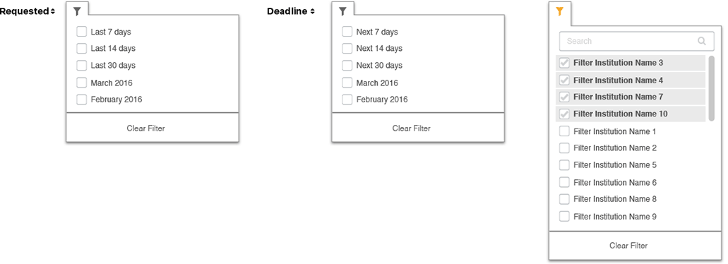
— This option utilizes header-level filtering, indicated by a filter icon next to the column name. Users can interact with any of the multi-select filters to reveal a complete list of available options. Within the individual dropdowns, users can select multiple criteria simultaneously to refine the table data. A search field is also integrated within the dropdown for quick option discovery.

multiselect for filter, version 2.0

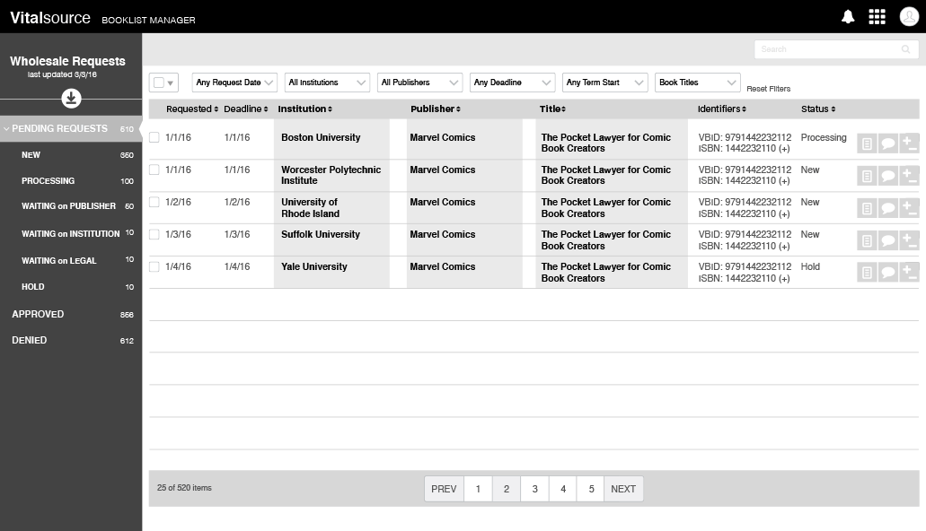
— This filtering mechanism is located directly above the table, featuring several exposed multi-select filter dropdown buttons. Users click a button to reveal a list of all available options, enabling them to select multiple criteria simultaneously to refine the table data.

Side Panel FIltering

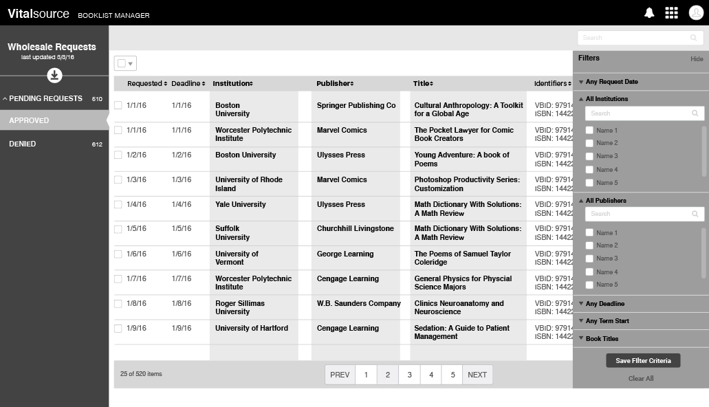
— This design implements a side panel filtering pattern, where the filter controls are initially hidden and revealed when the user clicks a specific trigger, such as a "Filter" button. The filter panel slides into view from the side of the screen, providing a dedicated and focused area for applying criteria. This approach conserves screen real estate while offering a comprehensive set of filtering options. The panel has distinct "Active" and "Static" views, clearly indicating when the user is interacting with the controls versus when the main data view is displayed.
Untitled UI logotext
Turning messy user problems into jaw-dropping digital experiences. Let's make some magic!
Home
Portfolio
New
About
Experience
Let'sTalk
© 2025 think-CARVER. All rights reserved.
TermsPrivacy Cookies